


I dream of fabric. And mixing patterns. That's normal, right? Captain Project happened to walk by as I was putting the finishing touches on this apron:

"That's a crazy combination of fabrics," he said. Pfft! I think it's awesome!
Some of my aprons are calm and soft in color and pattern, maybe a bit demure, but my heart really sings when I can effectively mix and match colors and prints! Using my aprons as aids, these are my tips for mixing it up ~ room decor, clothing or sewing projects.
My color mixing tips: To smartly mix color, keep the color wheel in mind:

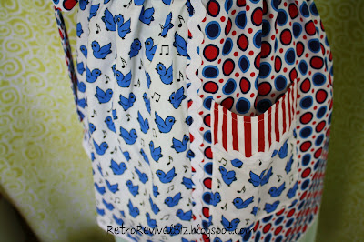
Tip 1: Colors next to each other always look great but so do colors that form 90 degree angles to each other, like the blue and red here:
Tip 2: Colors opposite each other work well together too, like the red and green on this apron:

Tip 3: Color combinations that form a "T", like yellow + green + blue, or blue + orange + violet-red, or yellow + violet + red-orange, etc. are lovely together:

Tip 4: Four-color combinations that form an "X", like blue + orange + violet red + yellow can be very whimsical:

Here are my tips for pattern mixing...
Tip 1: Polka dots, cherries and zebra stripes? Colorful bubbles and racing checks? Yes, they go together too, if you keep the scale of the patterns similar in size and frequency.

Tip 2: Use a similar color palette. For this apron, I used three different florals, all pastel shades of pink, blue and green


Tip 3: Use neutral colors to ground your pattern mixture. I began this apron with the whimsical drunken elephants on charcoal gray, and mixed in coordinating pink gingham + green and pink stripes + white polka dots on a lighter shade of gray:
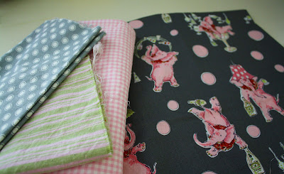
Tip 4: This combination of prints combines patterns of different sizes as well. Mixing a dense print (elephants) with sparse prints (the gingham, stripes and polka dots), balances all the patterns ~ the elephants are the focal point and the smaller prints compliment the overall look.

Tip 5: Using micro patterns, like this chocolate brown with white polka dots, as neutrals compliments bigger patterns. Closeup, this apron is a complex collection of patterns and not a solid brown.

Tip 6: Round/hard/soft rule: Using graphic and linear patterns like stripes and polka dots with organic patterns like florals (and birds in this case) is a classic way to effectively mix patterns:

I'd love to hear from you ~ what are your favorite color and pattern mixing tips for taking dressing, designing and decorating from ho-hum to harmonious?
August is winding down and I'll draw a winner for Beth's book on the 31st.

Click here for entry details.


14 comments:
Mixing colors and prints is so much more exciting and using one print. And your aprons are retro, the time we all had to "make do." A pretty selection of aprons, I wonder how many you have made over the years?
Thanks for these tips, Cindy! I think I must be a whimsical girl cuz my heart lifted when I saw that combo!
PS Please don't enter my name in the cook book drawing because I hardly ever use them. I'm a mostly cook from memory girl.
Cindy, great tips for fabric prints and colors! Your aprons always look so appealing and retro!
lln001
Thank you for the tips, I always have a hard time mixing prints and colors!
The colors that you choose work so well. I really think you have great taste on knowing how to put these together. Your tips are so appreciated, thanks so much. I really enjoy visiting your blog.
Blessings,
Susie
OH HOW I LOVE YOUR BLOG! so neat such fun things to do such color! what do Mr's know! lol what inspiration!!!! your newest follower grabbin a button! :) hugs kat=^.^=
I love mixing patterns, and I love your examples. Mixing up bright bold patterns is like a wonderful big jolt of caffeine- its exhilarating!
The examples are chose are all beautiful! Are they one-of-a-kind creations or are you selling them too? They just look so fun and cheery!
Shari
Gorgeous aprons Cindy.
I'm always amazed how people put fabrics together.
Chris
Australia
I love your aprons. They're so cheerful, with all the colors and prints.
Thanks for all the great tips!
Candy love all your mixing of colors and fabrics!! All your projects turned out just wonderful!! Thank you for the tips on how to mix colors- I need that!
Hi Cindy!
You know how much I love aprons?! Your post is such a delightful tutorial on achieving charming fabric combinations. I loved every photo...every apron...every tip!
Thank you for sharing, sweet friend!
Blessings,
Carolynn xoxo
Wow, you've been very busy girlfriend. So glad to hear that your show was a success, and congratulations on the sales of your shower caps......woohoo! Thanks for sharing the color wheel, as an artist's daughter I grew up learning all about color, composition, scale, etc., and it helps immensely when doing my sculpts. I keep thinking I'll post about stuff like that and I never seem to get around to it.
Have a great week,
Hugs,
Meri
Love seeing all the combination of fabrics you have used! Every apron is adorable and so "happy"!
Post a Comment